When Pantone announced Cloud Dancer (PANTONE 11-4201) as the 2026 Color of the Year, the internet had opinions. Mostly variations of “Really? White?” But here’s the thing about design: the most obvious choices are often the most misunderstood. Cloud Dancer isn’t a lack of imagination. It’s a creative reset button. Like a blank canvas, Cloud Dancer doesn’t dictate what comes next—it invites you to define it. Let’s unpack why this matters, how it reflects a shift in user behavior, and what designers should actually do with this information.
Stuti Mazumdar - January 2026

Why Cloud Dancer? Why Now?
Color of the Year selections aren’t arbitrary. They’re cultural read-throughs, user behavior, digital trends—they’re annual snapshots of our collective psychology. The past few years gave us Mocha Mousse (grounded sustainability), Peach Fuzz (post-conflict softness), and Viva Magenta (defiant optimism). Each one responded to a moment. Naturally, Cloud Dancer responds differently.
Pantone describes it as embodying “limitless possibility and infinite availability”. This isn’t about stripping things down because we’re tired as creative individuals. It’s about creating space for what comes next. Think about the cultural moment we’re in. The recent Pantone colors have been darker, richer, and even engaging. In the world of design, this translates to something powerful: Cloud Dancer is a launchpad, not a landing. It’s the interface equivalent of giving users a clean slate to think, create, and act without visual baggage. When you’re building products that help people solve problems, make decisions, or create something new, starting from white isn’t emptiness. It has limitless potential.
How to Actually Use Cloud Dancer in Digital Design?
Most trend analyses stop at “use more white.” Let’s get specific about how Cloud Dancer functions as a creative tool rather than just a palette choice.
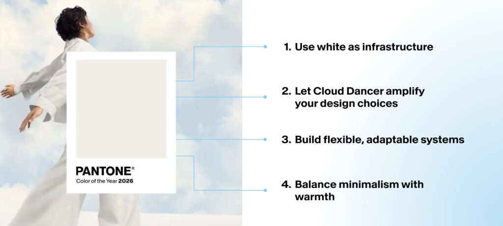
1. Use white as infrastructure
Cloud Dancer works best as the foundation that lets everything else perform. In user-centered design, your job isn’t to fill every pixel for a user to engage with, it’s to direct attention to what matters. Treat Cloud Dancer as the stage, not the performer. Build your information architecture around generous whitespace, then introduce color strategically where you need emphasis, emotion, or action.
2. Let Cloud Dancer amplify your design choices
It certainly opens up the floor for a 2026 full of creativity, acting as a versatile base that lets other colours shine. This is where Cloud Dancer becomes a competitive advantage. Instead of fighting for attention in a rainbow interface, use white to isolate and elevate one or two hero colors or elements. Your CTAs will convert better. Your data visualizations will communicate faster. Your brand colors will feel more intentional.
3. Build flexible, adaptable systems
“A blank canvas, the shade represents fresh starts and open space for creativity“. In practical terms, this means designing systems that can evolve. Use Cloud Dancer as your neutral base, then build theming layers on top. This is especially powerful for SaaS platforms, enterprise tools, or products serving multiple industries where different users need different visual contexts.
4. Balance minimalism with warmth
Cloud Dancer isn’t just a simple white; it’s soft, airy, almost textile in quality. Use it to create breathing room without feeling clinical. Pair it with organic textures, subtle gradients, and human photography to maintain emotional connection while keeping the interface clean.
What This Means for Design Teams Right Now
Here’s the strategic insight: Cloud Dancer opens the door for experimentation without risk. You’re not committing to a bold color trend that might feel dated in six months. You’re establishing a foundation that lets you test, iterate, and evolve your visual language without rebuilding from scratch.
This matters especially as AI tools are consistently evolving, proliferating our daily activities, and allowing interfaces to become more complex. The designers who win won’t be the ones adding more features or more visual flourishes. They’ll be the ones who understand that simplification is a creative act, not a lazy one. As we’ve explored in our work on cognitive load in UX design, reducing the mental effort required to process information creates better user outcomes.
When Cloud Dancer Doesn't Work
Not all trends should be embraced without speculation. Cloud Dancer thrives in spaces where users need to think, create, or make decisions. It doesn’t work when you need to energize, excite, or grab attention in a crowded market. If you’re building for entertainment, gaming, youth-focused brands, or cultural movements, neutral palettes might make you invisible.