The Density 2D plot
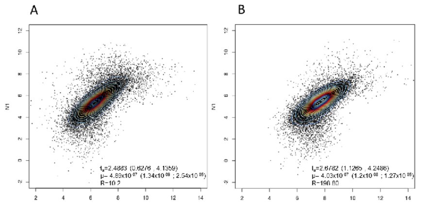
History of Density 2D A density plot is a smoothed, continuous version of a histogram estimated from the data. The most common form of estimation is based out of kernel density estimation (KDE). In this method, a continuous curve (the kernel) is drawn at every individual data point and all of these curves are then […]
Scatterplot
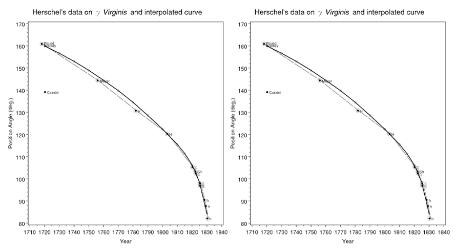
History of Scatterplot According to statistician Edward Tufte, more than 70% of all charts in scientific publications are scatterplots. Although no physical evidence remains, the research of Friendly and Denis indicates that the original scatterplot was made in 1833 by the English scientist John Frederick W. Herschel. For his study on the orbits of double […]
Histogram
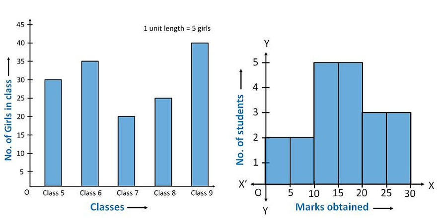
History of Histogram Karl Pearson introduced several now-commonplace statistical tools. One of these was the histogram, a diagram similar to a bar chart. The use of a histogram in statistics is to represent a set of continuous, rather than discrete, data. For this reason, Pearson explained that it could be employed as a tool in […]
Hexbin
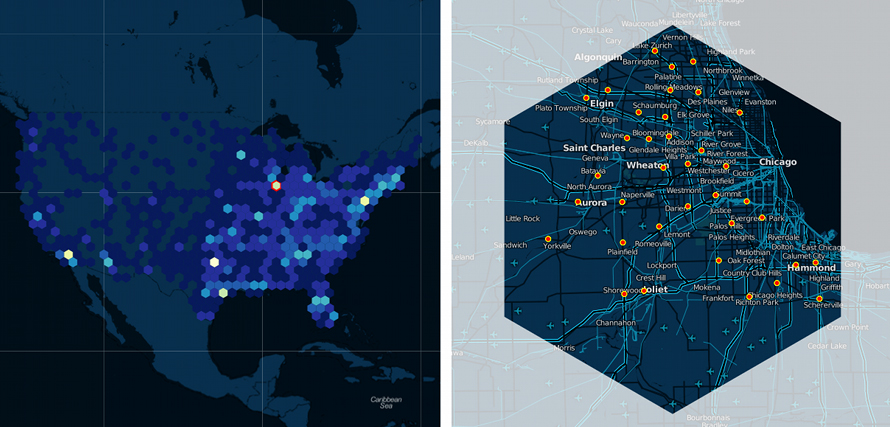
History of Hexbin In statistics, kernel density estimation (KDE) is a non-parametric way to estimate the probability density function of a random variable. Kernel density estimation is a fundamental data smoothing problem where inferences about the population are made, based on a finite data sample. In some fields such as signal processing and econometrics, it […]
Heatmap
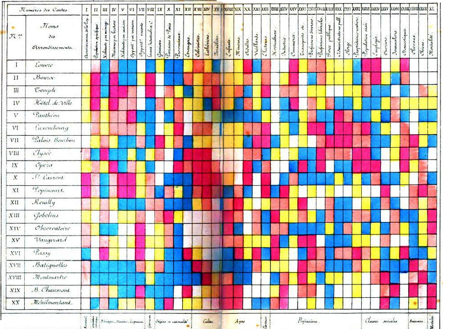
Heat Maps are most commonly used to display a more generalized view of numeric values as a graphical representation of data where the individual values contained in a matrix are represented as colors. It is commonly used as an isopleth representing regions of similar value using color splotches. Heatmaps use color the way a bar […]
Choropleth
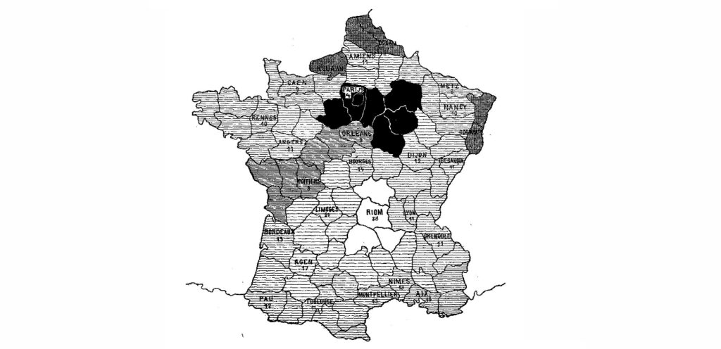
A choropleth map is a thematic map in which areas are shaded or patterned in proportion to the measurement of the statistical variable being displayed on the map, such as population density or per-capita income. Choropleth maps provide an easy way to visualize how a measurement varies across a geographic area or show the level […]