Web design has come a long way from a single page on a NeXT computer at CERN to what we experience today. What began as a tool for sharing scientific data between researchers is now one of the most complex, contested, and consequential design disciplines in the world. Every era of the web has asked something different of the people building it. In 2026, that demand has never been higher, or more interesting.
Stuti Mazumdar & Vidhi Tiwari - April 2024
1. Where the Web Began: Tim Berners-Lee and the First Web Page
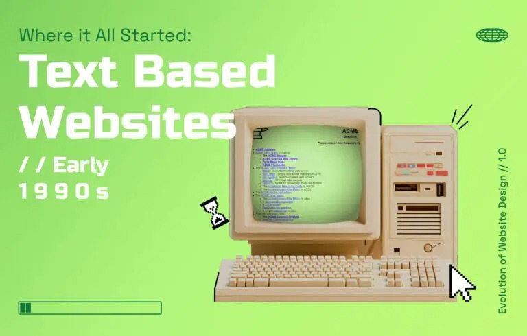
On August 6, 1991, Tim Berners-Lee published the world’s first website from his workstation at the European Organization for Nuclear Research (CERN). It was entirely text-based, which meant no images, no color, no layout beyond the default rendering of a browser. Its purpose was functional: a guide to the World Wide Web project itself.
The programming language making it possible was HyperText Markup Language (HTML). Simple, readable, and deliberately limited. It was designed for documents, not experiences. Nobody called it website design yet because there wasn’t much to design.
This version of websites was simple and static and didn’t change much once they were created. Graphic elements were limited, and interactivity was almost non-existent as designers had to manually code each element of the website, including text, images, and links, they stuck with plain backgrounds and basic fonts. The main focus was on delivering information rather than aesthetics.
In the mid-to-late 1990s, the world’s most important web programming language was invented, called JavaScript. It was originally called Mocha and later, LiveScript. It was invented to facilitate automation in interactions across websites. That is, it changed a text-based, static web page into an interactive one.
2. The First Design Decisions: Tables, Images, and CSS
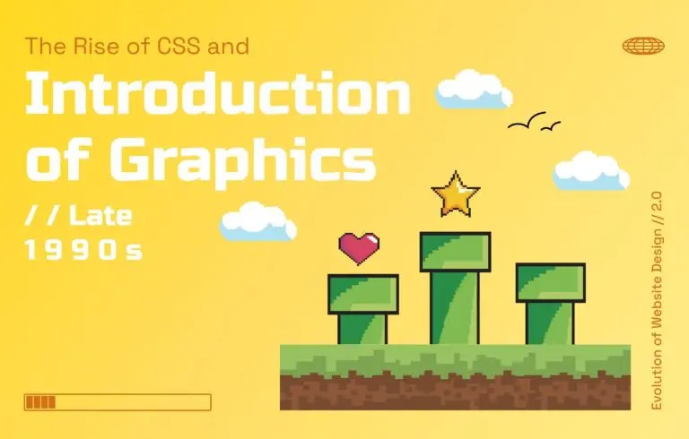
As browsers evolved and the web opened to the public in the mid-1990s, designers began pushing HTML beyond its original intent. HTML tables — built for displaying data — became the primary tool for creating multi-column layouts and complex designs. It was a workaround, not a system, but it worked well enough to define how web pages looked for nearly a decade.
In 1996, Cascading Style Sheets (CSS) arrived and changed the equation. For the first time, content and visual presentation could be separated. A designer could define color, typography, and spacing independently of the page’s structure. The design elements of a website were no longer hostage to the constraints of a markup language built for academic documents. This allowed for better organization of information and improved the overall user experience. Additionally, this allowed for easier maintenance, and consistency across pages, and opened the door for more creative design possibilities.
3. The Flash Era and the First Reckoning With User Experience
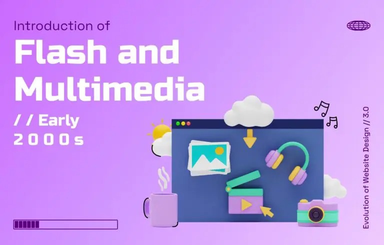
The early 2000s brought ambition. Flash enabled animation, sound, interactive storytelling, and visual complexity that HTML and CSS couldn’t touch. Websites became theatrical — intros played before homepages loaded, cursors left trails, and navigation was often more art installation than tool.
Flash also allowed for the creation of more complex user interfaces and navigation systems. However, it had its drawbacks.
The problem was the loading time. Dial-up connections couldn’t keep pace with the weight of what designers were building. The tension between aesthetic complexity and user experience surfaced for the first time.
4. Web 2.0: When Users Became the Designers
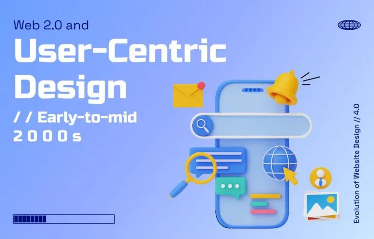
The beginning of the 2000s started with an increase in broadband speeds. Research suggests that by 2003, over 50% of users were surfing the internet with 32-bit hardware, enabling them a more efficient and enhanced experience.
This meant that the web reoriented itself around participation. Blogs, social networks, wikis and other such web pages were no longer just published; they were built in real time by the people using them. Websites started incorporating more user-generated content, such as comments, reviews, and forums. Social media integration became common, allowing users to share content and connect with others. Designers also started using Asynchronous JavaScript and XML (AJAX) to create dynamic web pages that could update content without refreshing the entire page. All this lef to the phrase “user experience” entering the mainstream design vocabulary during this period, not as a discipline but as a problem statement.
Additionally, content management systems, such as WordPress, democratized publishing entirely. You no longer needed to understand a programming language to have a website. Search engine optimization entered the design conversation for the first time, as visibility on Google became as important as what the site actually looked like. Design and discoverability were no longer separate concerns.
5. Responsive Web Design and the Mobile Inflection Point
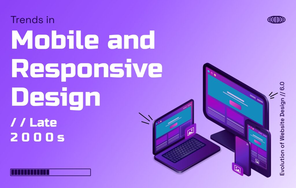
The iPhone launched in 2007. By 2010, it was clear that the desktop-first assumption that had governed website design for fifteen years was broken. Ethan Marcotte coined the term responsive web design in 2010 and within a few years, it became the baseline standard for anything built for the web.
Flat design followed close behind, partly aesthetic, partly practical. Skeuomorphic interfaces built to mimic physical textures looked cluttered on small screens. Flat design stripped interfaces back to their functional core: clear type, solid color, purposeful design elements. It was the era of web design’s most visible philosophical shift, which was from decoration to function.
“Every time the web changed platforms, from desktop to mobile, from static to dynamic, the designers who adapted fastest weren't the ones who learned new tools. They were the ones who understood why the change was happening.” — Deepali Saini | CEO at Think Design Collaborative
6. Design Systems and the Age of Scalable Consistency
As digital products grew in complexity through the 2010s, designing page by page became untenable. Design systems such as Google’s Material Design, Apple’s Human Interface Guidelines, and IBM’s Carbon established shared visual languages that could scale across hundreds of screens without losing coherence.
Search engine optimization grew more sophisticated alongside design practice. Google’s ranking signals, including page speed, accessibility, semantic structure, etc., increasingly rewarded the same things that a good user experience demanded. For the first time, the goals of website design and the goals of SEO were genuinely aligned.
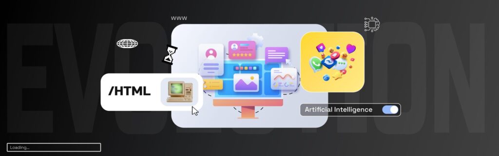
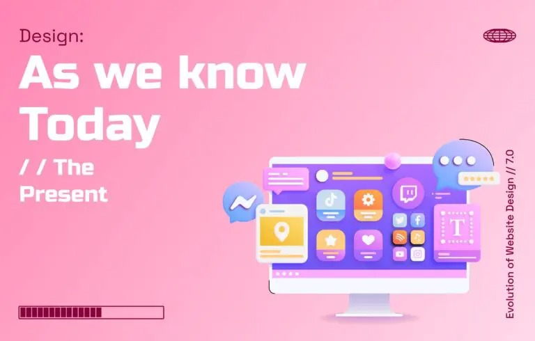
7. Where the Evolution of Web Design Stands in 2026
The evolution of web design in 2026 is defined by one central tension: the gap between what AI can generate and what designers can intentionally craft.
AI-based systems can now produce layouts, copy, and visual systems from a brief in minutes. AI-driven personalization means websites can adapt their content, hierarchy, and even visual tone in real time based on who’s visiting. Static homepages are increasingly a relic; after all, the same URL can render differently for a first-time visitor from a paid ad versus a returning user arriving from search. But the user experience of most AI-generated interfaces reveals the limits of generation without judgment. Technically coherent, visually acceptable, and experientially empty. The complex designs that AI produces fastest are often the ones least worth building. The role of the designer hasn’t diminished, it’s shifted from making to deciding.
What the Next Era of Web Design Will Need
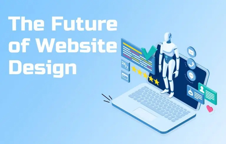
The web’s next chapter is already visible in its edges. Voice-activated interfaces are moving from experimental to expected, asking designers to think about user experience across environments, not just screens. Ambient web experiences, that is content that surfaces across devices, contexts, and environments without requiring deliberate navigation, are reframing what a web page even is.
Moreover, ethics is no longer a footnote. Dark patterns, manipulative design elements, and interfaces engineered for engagement over function are drawing regulatory attention globally. The designers and organizations that treat ethics as a design constraint instead of a legal one will define what the next era looks like.