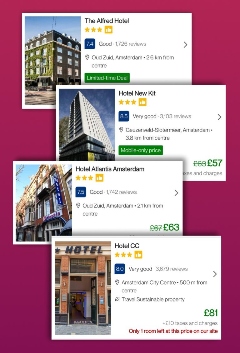
This dark pattern works on the idea of scarcity and how a user’s decision making is impacted under the pretext of scarce resources. False urgency works on the basis of loss aversion which is the notion that users prefer to avoid losses over acquiring gains.
Stuti Mazumdar & Symran Bhue - April 2022

How this pattern gets its name?
This dark pattern gets its name from the false belief it creates in the user’s mind about the scarcity of resources. It also deceives the users at the level of social proof ( if other people are doing it, it must be good and I should be a part of it).
How to identify this pattern?
This design pattern is asymmetric and deceptive at the same time. The metric being optimised is conversion. It is used in most e-commerce platforms in the name of a sales strategy.
The design usually employs a countdown, a timer, or a count of some sort. All limited time offers fall in this category of dark patterns. These patterns are of two basic types, either the user has limited time until a discount runs out and they may be required to pay full price or until the item, they are eyeing goes out of stock.
Examples
Websites such as bookings.com are fraught with such patterns. Below, we see 4 ways in which bookings.com is creating a false sense of urgency in the user’s mind: one – offering a discount, two – offering a discount for a limited time, three – offering a discount based on the device used and four – making the listing appear scarce.

The above information may all be true or may all be false but the user has no way of finding out.
What happens after your time runs out? Usually nothing. The limited-time offer refreshes and gives you another 10 mins.
How to make it an ethical design pattern?
In this day and age when users are making every purchase decision based on the kind of deals available and sometimes evaluating the options available itself can be an overwhelming experience, buyers need a cool-off period to contain their impulses before making a decision in haste. The fear of missing out is real and designers need to ensure to not play on this fear through false beliefs.


