In the dynamic world of user experience design and communication, designers and developers have been witnessing trends ranging from busy interfaces of the 90s to minimalistic design in the late 2000s. The clean, neat design is powered by a silent force that shapes perceptions and elevates the entire visual experience—white space.
Stuti Mazumdar & Vidhi Tiwari - June 2024

Whitespace, or empty space, is not merely the absence of content or graphics; it’s a deliberate and strategic choice, a design philosophy that helps maintain the balance between elements on an interface. And with the growing need to understand what clean design means, it is essential we get a grasp of how to effectively use the power of white space in design.
What Is White Space?
Whitespace, often referred to as negative space, is the unmarked, empty area surrounding the elements on a page. It actively guides the viewer’s focus between the content and graphic elements and defines relationships between elements. On a large scale, it sets the overall structure, while on a smaller scale, it ensures readability by spacing out text and images.
This intentional use of whitespace is like a visual breather, preventing clutter, enhancing elegance, and allowing users to focus on one idea at a time. When accurately used in design, it holds the power to create visually compelling compositions that not only look good but also effectively convey messages.
Kinds Of White Spaces
Understanding whitespace goes beyond acknowledging its mere existence; it involves recognizing its different forms and functions. Different kinds of white spaces help designers define the kind of tone they wish to set for a user interface, ensuring efficient delivery of an idea to the users.
1. Macro White Space

This kind of white space refers to the spacious gaps between major design elements including components like margins, padding, and overall layout structure. It features space in between and on the right and left of most websites content blocks, giving the design a margined look.
Macro white space helps establish the overall visual hierarchy and lends a sense of openness to the design.
2. Micro White Space
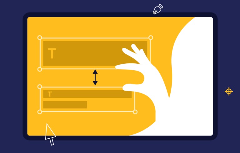
On a more granular level, micro white space is the subtle spacing between smaller elements, such as lines of text, images, and buttons. This kind of padding is often stated as rules or guidelines in a design library set at the start of the project to ensure consistency is maintained. It aids in preventing visual clutter, making content more digestible, and enhancing readability.
3. Active White Space

This is the intentional use of whitespace to draw attention to a specific element. By isolating an element using surrounding negative space, designers can highlight the importance of the element, killing any noise around it. This, in turn, helps guide the viewer’s focus to what matters the most in the section of the interface.
4. Passive White Space

Unlike intentional white spaces, passive white space is naturally created in areas such as between words, line breaks, around graphic elements like logos, etc. It passively gives the user visual breaks in between the body of content on the screen.
By defining kinds of white spaces, we document the elements that together help make white spaces across interfaces. They range from smaller elements such as letter and line spacing to bigger elements such as margins, paddings, and gutters around the content.
Why Should We Use White Space?

1. Enhanced Readability
White space in design plays a pivotal role in improving the legibility of text. Ample spacing between lines and paragraphs reduces cognitive load, making it easier for the reader to navigate and comprehend the content.
2. Visual Clarity and Focus
With an overwhelming amount of information consistently thrown at users online, white space serves as a visual breather to help cut the noise. It allows the viewer’s eyes to rest and guides them to focus on the most critical elements.
3. Improved User Experience
From websites to printed materials, incorporating whitespace enhances the overall user experience. It provides room for interactive elements, making navigation more intuitive, and contributes to a more enjoyable and seamless interaction with the design.
4. Elevated Appeal
White space is the secret ingredient in creating aesthetically pleasing designs. It brings balance, elegance, and sophistication to visual compositions, elevating the overall design of a website, advertisement, or any design project.
5. Brand Identity
The strategic use of white space contributes to defining a brand’s identity. It communicates a brand’s values—whether they are focused and organized or creative and luxurious. Consistent use of negative space can also become a recognizable part of a brand’s visual language to help set it apart from the rest of the competition.
6. Psychological Effects
Interfaces with visual clutter may overwhelm users. However, correct use of white space can help create a well-balanced and focus-inducing user experience to evoke a feeling of calm and focus.
As we peel back the layers of whitespace, we discover its ability to enhance readability, guide focus, and contribute to the overall aesthetic appeal. Thus, making it an essential part of design principles followed by designers and developers globally.
The Role Of White Space In Upcoming Design Trends

As technology evolves, we look forward to responsive and adaptive design styles leveraging white space to ensure seamless user interactions across diverse devices.
Moreover, the fusion of augmented reality (AR) and white space holds promise in creating immersive and engaging experiences. The strategic use of negative space may evolve to dynamically adapt to user interactions in real time, further enhancing the visual storytelling experience.