In the realm of design, where every pixel and element helps tell the designer a story through visual communication, the role of white space in your design cannot be overstated.
It silently conducts the symphony of aesthetics and orchestrates the transformation of an ordinary, cluttered interface into an elegant, minimalistic experience. White space in design is not the absence of content or graphic elements, but a strategy that helps maintain the balance and resonance of every composition.
Stuti Mazumdar & Vidhi Tiwari - June 2024
Through this comprehensive guide, we will help you unravel the importance of white space, the kinds of white spaces, and the principles of using it in design to elevate your design style.
What Is White Space?
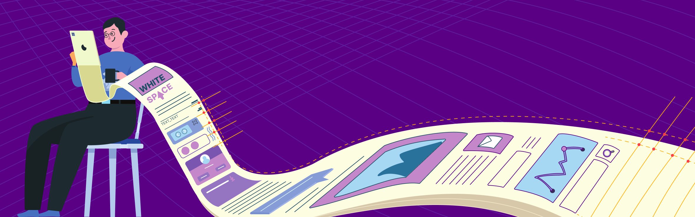
As the name suggests, white space, also known as negative space, is the space around a design element, content, or graphics, that helps create a visual break from the clutter. It is the breathing room around and within design elements that allows them to speak with clarity and resonance. This seemingly empty space can take various forms – from the margins and gutters to the spacing between letters and the gaps within images, each contributing to the overall composition.
White space is an important element of your design language in this digital era that prioritizes decreasing the cognitive load on users. Understanding white space requires recognizing it as a dynamic force rather than a passive background. White space on an interface is more than just a visual break but an element that guides the users’ eye, influences perception and molds the user experience.
Type Of White Spaces
Designers should hold fundamental knowledge about white space and its types before understanding the nuance of using white space in design. Here’s a comprehensive breakdown of the types of white spaces.
1. Micro White Space
- This kind of white space involves the subtle gaps between letters, lines, and smaller design elements. While these spaces in the content don’t appear to be significant, they impact a user’s reading and scanning abilities across the interface.
- It is a critical element to enhance legibility, prevent visual clutter, and ensure clarity in text-heavy designs.
- It refines the details and contributes to a polished and sophisticated appearance to the overall design.
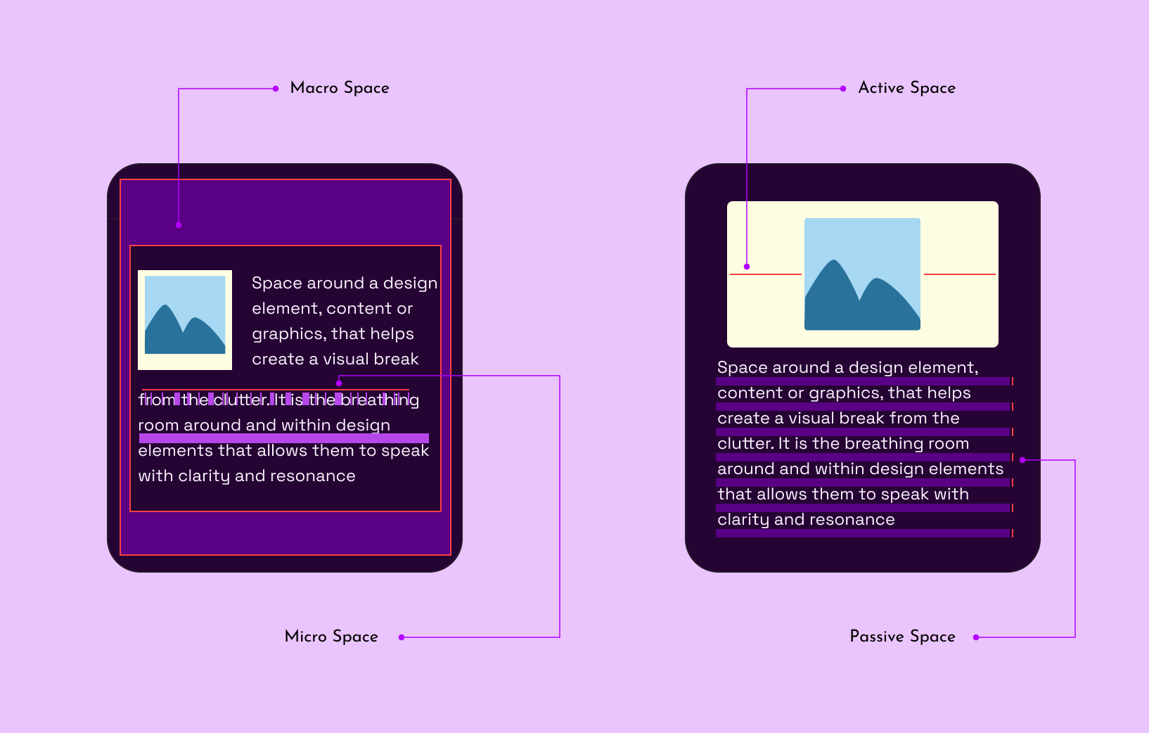
2. Macro White Space
- Macro white space governs the layout in the bigger picture, influencing the space between major components like images, columns, and sections to provide.
- It establishes a sense of hierarchy and order in the overall design, guiding the viewer through a well-structured composition. The hierarchy this white space produces helps busy users quickly go through the body of content, mostly scanning through the headlines and summaries.
- It provides the necessary breathing room to each element, highlighting them independently while contributing to the harmony of the entire layout.
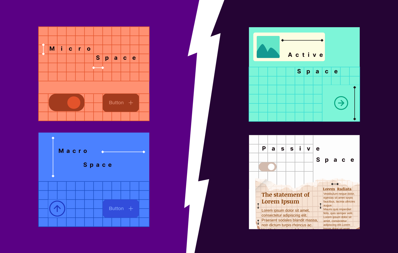
3. Passive White Space
- This kind of white space refers to the unmarked and unintentional spaces that naturally occur within a design. A great example would be line spacing or paragraph breaks between the body of text on the interface.
- While it may seem unassuming, passive white space significantly impacts the overall aesthetics and readability of a layout. And it does so naturally!
- Designers must be mindful of passive white space to prevent unintentional visual noise and maintain a cohesive design.
4. Active White Space
- Active white space is intentional and purposeful. It is always strategically placed to enhance the visual appeal of the interface, retain the viewer’s focus throughout the content, and improve the overall user experience.
- It includes deliberate spacing around key elements, such as headlines, images, or call-to-action buttons, to draw attention and create a sense of importance.
- Active space acts as a powerful tool in creating a balanced and engaging design, where every element contributes meaningfully to the overall narrative.
Principles of Using White Space Well

When crafting interfaces for this digital era, knowing all about the design principles that govern the use of white spaces is essential. While these may be adjacent to the commonly practiced principles, they work in conjunction to ensure a balanced and clean interface design.
1. Embrace Minimalism: Minimalist design relies heavily on white space to create an uncluttered look. By eliminating unnecessary elements, you allow the remaining components to breathe, creating a sense of simplicity and elegance.
2. Prioritize Content: Upon identifying the core message you wish to deliver through your design and content, giving it the space it deserves is a foolproof way of garnering the required user attention. Whether it’s a headline, product image, or call-to-action button, strategic placement of white space around specific elements draws attention to key elements, guiding the viewer’s focus.
3. Grid Systems: It is ideal for designers to utilize grid systems to establish a consistent layout with well-defined white space. Grids provide a guiding framework for organizing content, creating a sense of order and coherence that contributes to a visually appealing design.
4. Experiment with Asymmetry: While balance is crucial in design, experimenting with asymmetric placement of design elements and content can add a bit of dynamic fun to the interface. Use white space intentionally to create a sense of movement and interest, drawing in your viewers’ attention.
Who’s Used It Well?
When talking about how to use white space well, we can’t really leave you hanging without some real-world examples of what good use of white space looks like.
How has Apple used it well?
The Apple website is a prime example of using white space to showcase products elegantly. Each product shot is given ample room to shine, creating a sense of exclusivity and sophistication. The minimalist approach not only enhances the user experience but also establishes a powerful brand identity.
Google’s Brilliant Minimalist Design
Google’s homepage is a testament to the power of micro white space. The minimalist design puts the search bar at the center, surrounded by ample white space, allowing users to focus on the primary function. The simplicity and clarity of the layout contribute to Google’s user-friendly reputation.