Bar charts are a fundamental tool in data visualization, widely used for their simplicity and effectiveness in making comparisons across categories.
Following best practices in bar chart design – such as starting the value axis at zero, maintaining consistent bar widths, and using clear labels, ensures accurate and honest representation of data. Whether you’re creating a bar plot for comparison or a detailed bar chart visualization, these principles help convey insights clearly and avoid common pitfalls like misleading scales or visual clutter.
History of Bar Chart
The earliest known use of a bar chart dates to the 14th century when Nicole Oresme plotted the velocity of a constantly accelerating object against time in The Latitude of Forms. In 1765, Joseph Priestley created a timeline-style chart using horizontal bars to visualize the lifespans of historical figures. However, William Playfair is widely credited with inventing the modern bar chart. In 1786, his Commercial and Political Atlas featured a bar chart showing Scotland’s exports and imports over a year, marking the first clear use of bars to compare discrete numerical data. Playfair’s work laid the foundation for the bar chart as a key tool in data visualization.
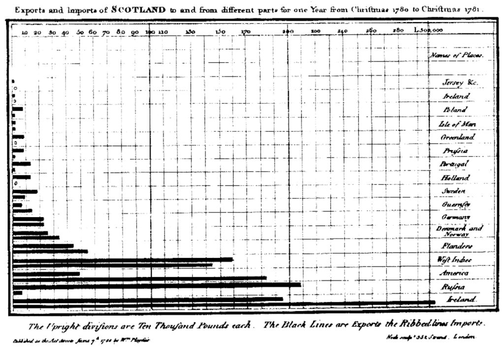
Nicole Oresme’s chart The Latitude of Forms b) Exports and Imports of Scotland to and from different parts for one Year from Christmas 1780 to Christmas 1781 c) A Chart of Biography to serve as visual study for Joseph Priestly’s Lectures on History and General Policy
When to Use Bar Chart Visualization?
1
To Compare a Large Set of Categorical Values
Use bar charts or bar graphs to visually compare large sets of categorical data, especially when categories are qualitative such as months of the year, age groups, shoe sizes, or animal types. These charts excel at showing proportions, rankings, and differences among discrete groups, making them ideal for bar chart visualization focused on clear comparisons.
For larger datasets, horizontal bar chart design offers better readability, as the vertical alignment of labels provides more space for longer category names. This makes horizontal bar charts a preferred choice over column charts when dealing with extensive categories.

A bar chart comparing the wind energy production in different states of USA
Source
2
To Compare Multiple Categories or Sub-Categories
Use bar charts when you need to compare multiple categories and sub-categories simultaneously. A clustered bar chart (also called a grouped bar chart) displays bars grouped side-by-side within each category, allowing you to compare values across different series clearly. This type of bar chart visualization is ideal for showing how various sub-groups contribute to their category totals.
For example, a 100% stacked bar chart works well to highlight the proportion each sub-group contributes to the whole, making it easy to assess relative performance within and across categories.

Stacked bar chart comparing consumer spending across different categories for different generations
3
To Visualize Two Data Sets on a Single Chart
Use overlapping bar charts to compare two similar data sets within a single visualization. This approach employs bars of different widths layered on the same axis, allowing easy side-by-side comparison of categories against discrete values. On one axis, the bars represent categories, while on the other, they reflect measured values. With interactive features like selecting or deselecting legend labels, you can focus on a single data set or compare both simultaneously.

Overlapping bar chart comparing branch efficiency across locations in terms of people and profits
Source
4
To Gather Insights on Deviations in Data
Use column charts (vertical bar charts) when you need to compare values that include both positive and negative numbers. They are especially effective for visualizing deviations from a benchmark or average, making them ideal for performance comparisons and deviation analysis. Unlike horizontal bar charts, column charts are well-suited for highlighting trends over time or across categories with shorter labels.
By following bar chart best practices, such as maintaining clear axis scales and consistent bar widths, column charts help reveal insights into how data points vary above or below a reference value, supporting more informed decision-making.

Column chart comparing net migration for different countries
Source
Types of Bar Charts
These charts are arranged from highest to lowest incidence.
2. Column or Vertical Bar Charts
3. Stacked Bar Chart
Stacked bars that represent different groups on top of each other. The height of the resulting bar shows the combined result of the groups.
4. Grouped Bar Chart
For each categorical group, there are two or more bars which are color-coded to represent a particular grouping.
When Not to Use a Bar Chart Visualizations
1
To represent and compare a continuous set of data
Do not use Bar Graphs when you need to represent continuous ordered quantities. In case of continuous data (such as a person’s height) needs to be represented then use a Histogram. It is a best practice to leave gaps between the bars of a Bar Graph, so it doesn’t look like a Histogram.
2
To represent trends in time and other variables
Use Line graphs to represent trends in numerous quantities over time, by using multiple lines instead of using bar graphs which will make it more difficult to visualize multiple trends even with stacked or group charts. Line graphs have an advantage in that it’s easier to see small changes on line graphs than bar graphs, and that the line makes the overall trends very clear.