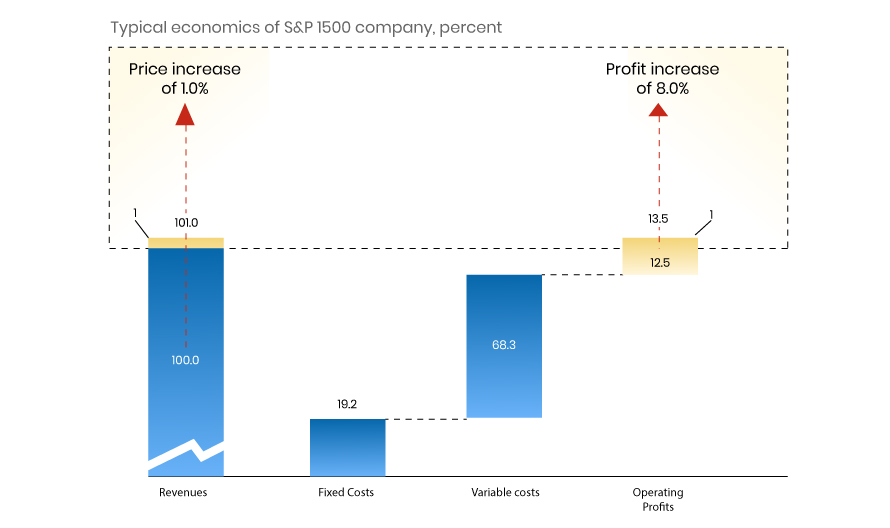
Waterfall Chart
History of Ben Shneiderman is considered to be the inventor of Treemaps. He created treemaps as a way to visualize a vast file directory on a computer, without taking up too much space on the screen. Treemap has subsequently become an essential method for displaying hierarchical data using nested figures and rectangles in information visualization […]
Venn Diagram
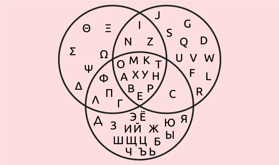
History of Venn Diagram These charts were first mentioned in the 1880 paper entitled “On the Diagrammatic and Mechanical Representation of Propositions and Reasonings” in the Philosophical Magazine and Journal of Science. But the roots of these types of charts go back much further, at least 600 years. In the 1200s, philosopher and logician Ramon […]
Treemap
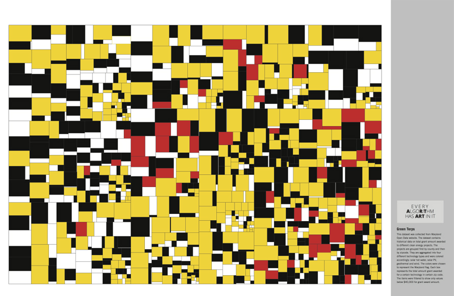
History of Treemap Ben Shneiderman is considered to be the inventor of Treemaps. He created treemaps as a way to visualize a vast file directory on a computer, without taking up too much space on the screen. Treemap has subsequently become an essential method for displaying hierarchical data using nested figures and rectangles in information […]
Sunburst
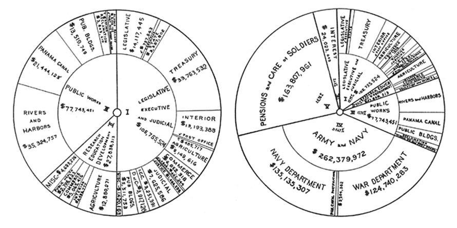
History of Sunburst It is likely that the Sunburst Chart type of data visualization was developed to accommodate subunits of the Pie Chart’s primary segments. Sunbursts emerged as a variant of pie charts, which explains why they are also known as multilevel pies, or, simply, nested pie charts. The earliest known example of pie charts […]
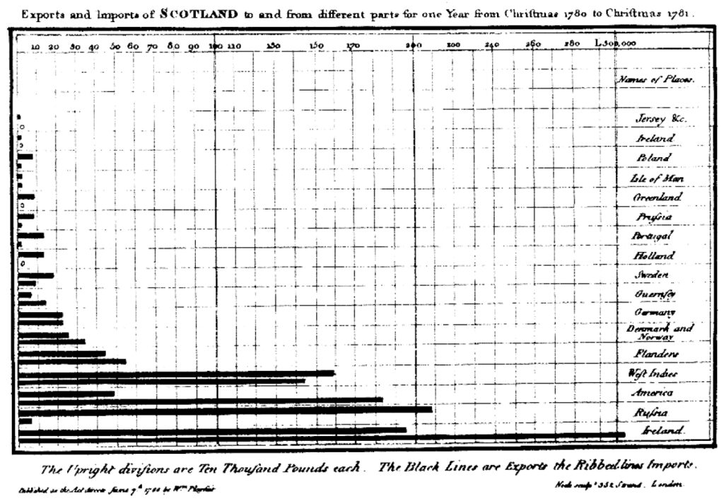
Stacked Bar Chart
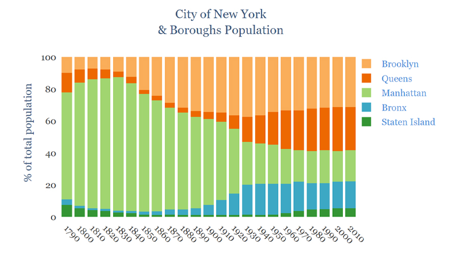
History of Stacked Bar Chart Stacked bar charts evolved out of the bar charts which were first used in the 14th century and later published by William Playfair in The Commercial and Political Atlas to represent export and import of Scotland. Bar graphs evolved to be used for more complex comparisons of data with grouped […]
Pie Chart
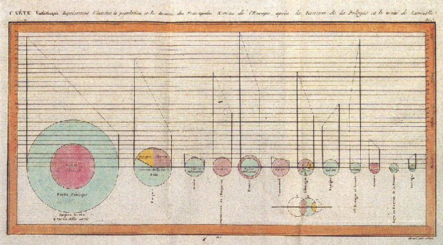
History of Pie Chart Pie charts have been used across history however are first credited to be used by William Playfair’s in 1801 to represent Statistical Breviary of 1801 and the proportions of the Turkish Empire located in Asia, Europe, and Africa before 1789. In 1858 a French engineer named Charles Joseph Minard used pie […]
Circular Barplot
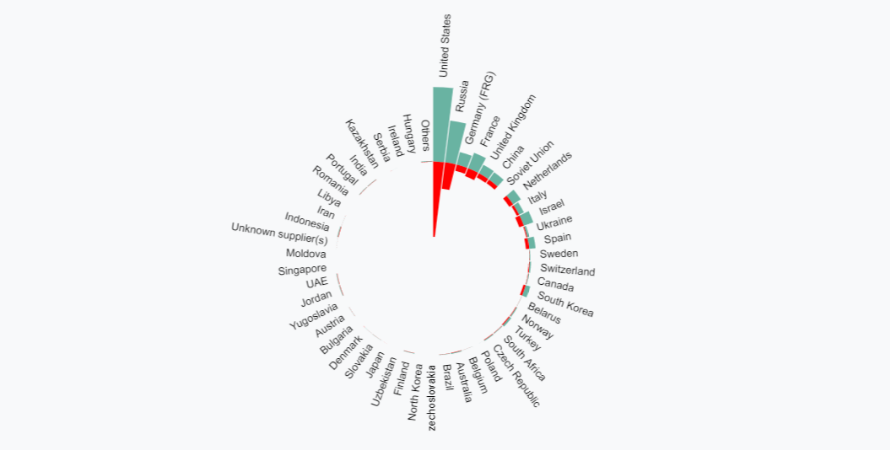
A circular barplot is a plot where each bar is displayed along a circle instead of a line. Here no Y scale is displayed since exact values are written on each bar which could also be represented on interaction with the chart. The chart is popular for its visual appeal however and needs to be […]
Bar Chart
Bar charts are a fundamental tool in data visualization, widely used for their simplicity and effectiveness in making comparisons across categories. Following best practices in bar chart design – such as starting the value axis at zero, maintaining consistent bar widths, and using clear labels, ensures accurate and honest representation of data. Whether you’re creating […]
Area Chart
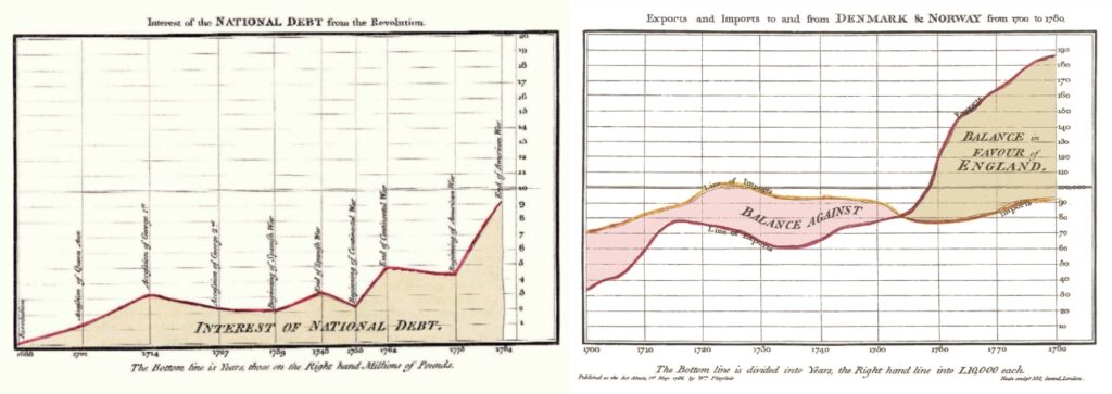
An area chart or area graph is based on the line chart but is used to primarily communicate the summation of data rather than represent individual data values, as in line charts. The area between axis and line is usually emphasized with colors, textures or hatchings. The area underneath the line can help one to […]