Treemap
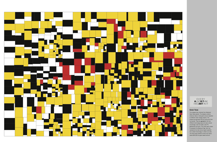
History of Treemap Ben Shneiderman is considered to be the inventor of Treemaps. He created treemaps as a way to visualize a vast file directory on a computer, without taking up too much space on the screen. Treemap has subsequently become an essential method for displaying hierarchical data using nested figures and rectangles in information […]
Tag Cloud
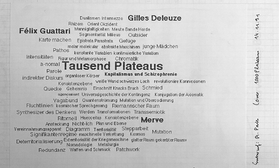
History of Tag Cloud The earliest printed example of a weighted list of English keywords was the “subconscious files” in Douglas Coupland’s Microserfs in 1995. This popularized tags becoming commonly used on geographic maps to represent the relative size of cities in terms of relative typeface size. The “tag cloud” rose to prominence in the […]
Stacked Bar Chart
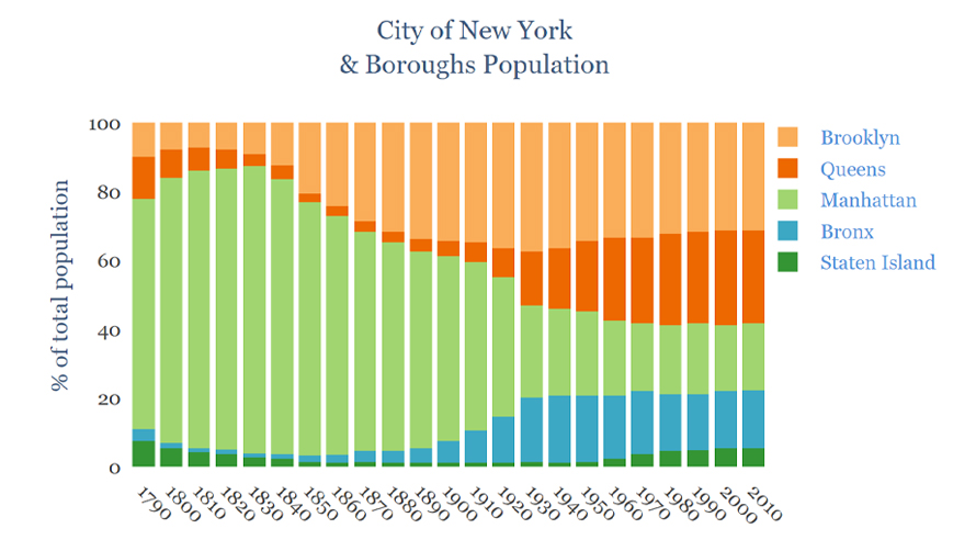
History of Stacked Bar Chart Stacked bar charts evolved from early bar charts popularised by William Playfair. Over time, they expanded into more complex forms such as grouped and stacked bar chart variations to handle multi-dimensional comparisons. The stacked bar charts not only allow us to see the category totals first but also get a […]
Spider Graph: A Network Visualization Technique
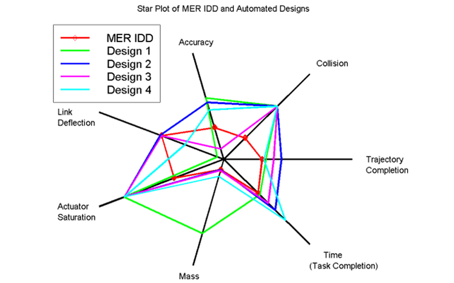
History of Spider Graph The star plot, a precursor to the spider graph, was first used by Georg von Mayr in 1877. Unlike glyph plots, radar charts use multiple variables together to construct the star-shaped figure, which often appears arranged in a rectangular grid for easier pattern recognition. This early use of polar diagrams and […]
Pie Chart
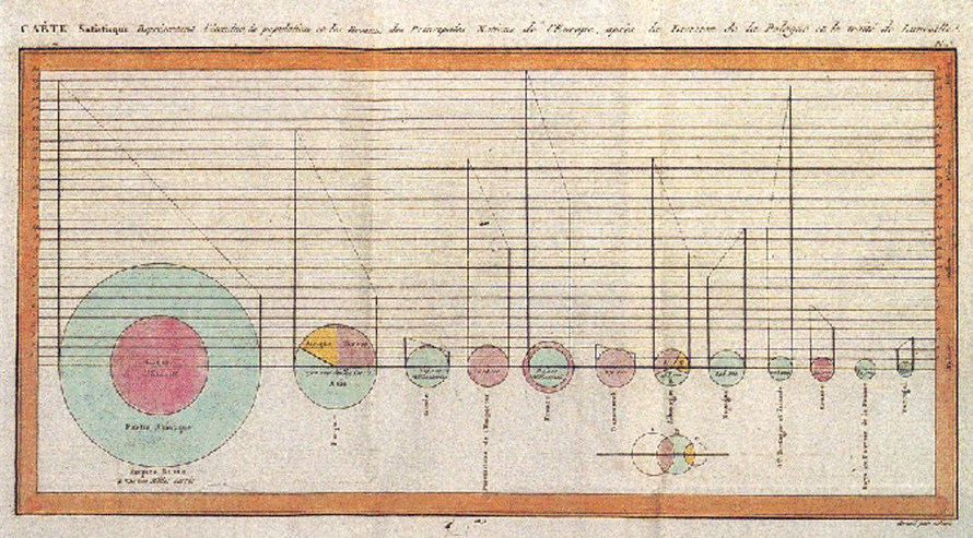
History of Pie Chart William Playfair first wielded pie charts in his 1801 Statistical Breviary, mapping the Turkish Empire’s land across Asia, Europe, and Africa. French engineer Charles Joseph Minard advanced them in 1858, tracing cattle flows to Paris. Florence Nightingale then popularized the form through her famous polar area diagrams showing mortality causes—proving pie […]
Line Chart
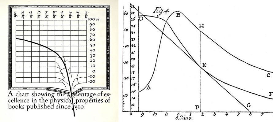
History of Line Chart Early pioneers include Francis Hauksbee, Nicolaus Samuel Cruquius, Johann Heinrich Lambert, and economist William Playfair. Playfair’s 1786 Commercial and Political Atlas featured 43 line chart variants exploring economic/political time-series data. Lambert used them in 1767 physics discoveries. By 1919, parody graphs like Dwiggins’ printing standards critique showed their cultural reach. Published […]
Heatmap
Heatmaps are commonly used as isopleth-style displays to represent regions or areas of similar value using continuous color gradients or colour “splotches.” In digital product contexts, heatmap analysis is widely used to understand user interaction with interfaces, making complex behaviour data self-explanatory for designers, product teams, and business stakeholders. History of Heatmap Heat maps originated […]
Gantt Chart
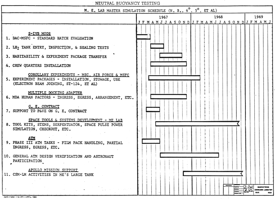
History of Gantt Chart The first Gantt chart precursor, known as the harmonogram, was devised in the mid-1890s by Polish engineer Karol Adamiecki. Around 1910, American engineer Henry Gantt created his version, which gained widespread popularity in Western countries. Early Gantt charts were handmade, requiring complete redraws for schedule changes until computers automated adjustments by […]
Bubble Chart
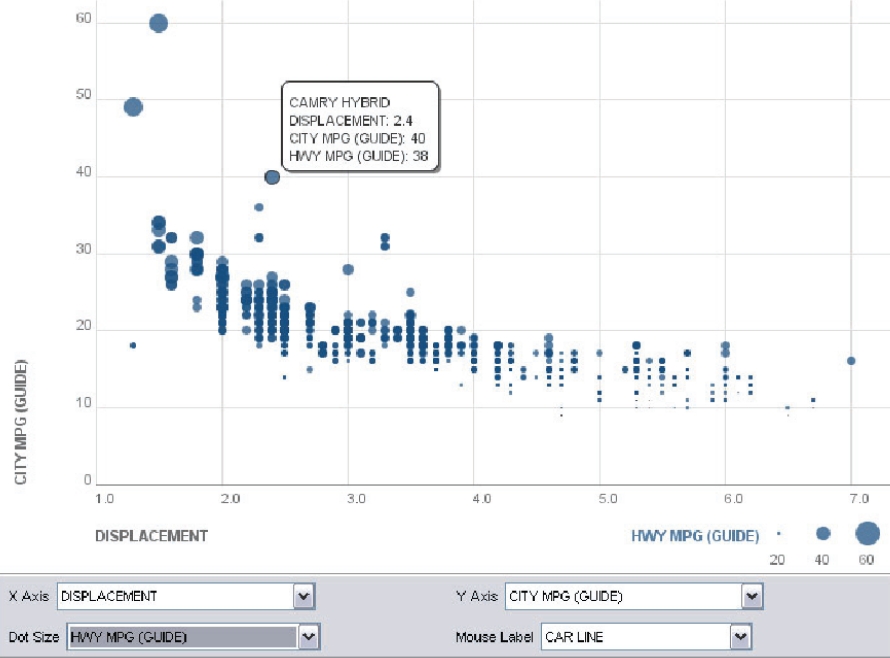
History of Bubble Chart Bubble charts were introduced by Fernanda Viegas and Martin Wattenberg as visualizations using labelled circles, where the area of each bubble is proportional to its data value. This design performs a visual square-foot transformation, making it an effective way to display hierarchical or quantitative data. Since their introduction, bubble charts have […]
Circular Barplot in Data Visualization
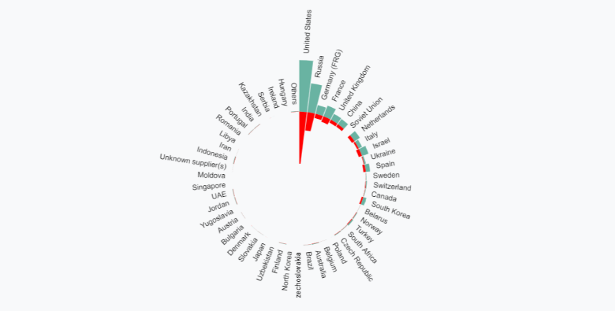
Circular barplots are ideal when you want to present data in an engaging, compact format, especially when dealing with cyclical or grouped data. However, understanding the limitations in readability and axis interpretation is important to avoid miscommunication. History of Circular Barplot Circular barplots evolved from traditional bar charts to present data with enhanced visual appeal. […]